FileMosaic
File mosaics are compact elements that represent a file in the UI. They can be used for just showing general info of the file, or either to allow the user to interact with them.
This widget allow users to see information of
Files
and / or trigger actions.Basic FileMosaic
The
Also, the
FileMosaic component supports displaying information from a object or from given props.Also, the
onDelete
prop is used to remove the file selection.file created from props.jsx
<> {value ? ( <FileMosaic {...value} onDelete={removeFile} /> ) : ( <FileInputButton value={value ? [value] : []} onChange={updateFiles} /> )} <FileMosaic {...sampleFileProps} /></> // file propsconst sampleFileProps = { id: ":0:", size: 28 * 1024 * 1024, type: "text/plain", name: "file created from props.jsx",};Image preview
By setting the
To acomplish this task this component will take the
Finally, the
preview prop to true
the component will show an image preview instead of a file icon.To acomplish this task this component will take the
imageUrlprop or will read the File
object if given and if it is an image.Finally, the
info
prop is used to show the complete information of the file.
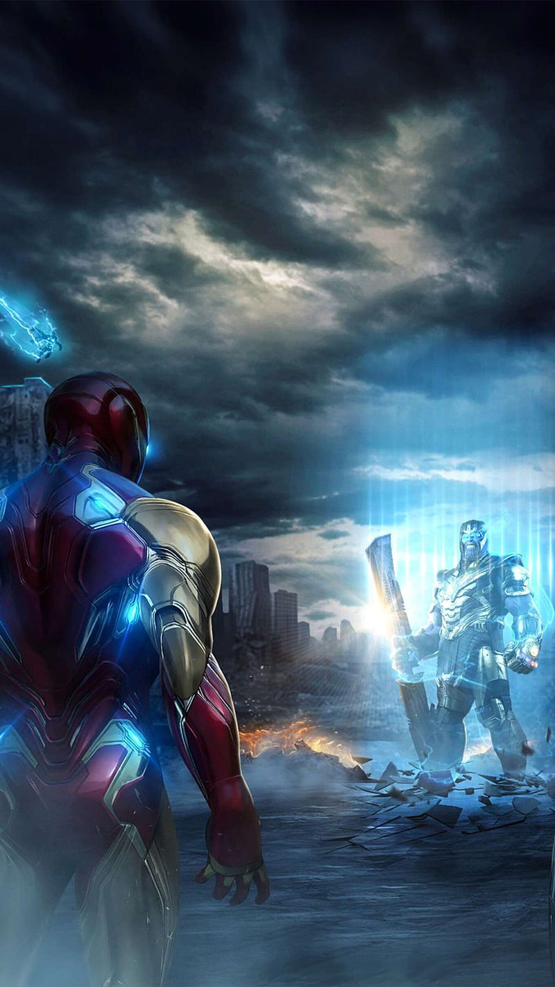
Thor arrives wakanda.jpg
<> {value ? ( <FileMosaic {...value} onDelete={removeFile} info preview/> ) : ( <FileInputButton onChange={updateFile} accept="image/*"/> )} <FileMosaic {...sampleFileProps} info/></> // file propsconst sampleFileProps = { id: "fileId", size: 28 * 1024 * 1024, type: "image/jpeg", name: "Thor arrives wakanda.jpg", imageUrl:"https://cdn.wallpapersafari.com/0/95/1zms6H.jpg"};Validation
The
valid prop can be set to true
, false
or undefined
.file created from props.jsx
valid file created from props.png
File is too big. File type is not allowed. non valid file created from props.jpg
Uploading status
The
Each of the following examples demonstrates one state combination of the FileMosaic component.
uploadStatus prop can be set to "preparing"
, "uploading"
, "aborted"
, "error"
or "success"
. Also the uploadMessage prop is used for displaying the error or success message. Finally, the progress prop can be used to show the current progress of the upload process.Each of the following examples demonstrates one state combination of the FileMosaic component.
preparing stage
preparing file.jsx
preparing file.jsx
uploading stage
uploading file.png
uploading file.png
uploading file.png
uploading file.png
upload result stage
upload aborted file.gif
Upload was aborted by the userupload with error file.jpg
File couldn't be uploaded to Files-ui earthquakes. File was too big.successfully uploaded file.png
File was uploaded correctly to Files-ui earthquakesActions: info, delete, see, watch, download
You can use the following actions.
- FileMosaic with the
onDeleteprop will display a delete icon. - FileMosaic with the
infoprop will display an "info" icon that will display an info layer. - FileMosaic with the
onSeeprop will display the "see" button that can be used to retrieve an imageURIobtained by reading aFileobject if given or just theimageUrlprop if given. In the first case, the file must be an image. - FileMosaic with the
onWatchprop will display the "play" icon that can be used to retrieve the video as aFileobject if given or just thevideoUrlprop if given. The file must be an video. - FileMosaic with the
downloadUrlprop will display the "download" icon that can be used to start the download. If theonDownloadprop is given, the "download" icon will also be visible, but it will be taken as the user will perform their own download.
actions sampleFile.jsx
actions sampleFile.jsx
actions sampleFile.jsx
actions sampleFile.jsx
actions sampleFile.jsx
download_fileactions sampleFile.jsx
download_fileDark mode
The
FileMosaic component supports dark mode by setting the prop darkMode
to true
.sampleFile.jsx
sampleFile.jsx
<> <FileMosaic {...sampleFileProps} info onDelete={removeFile} /> <FileMosaic {...sampleFileProps} info onDelete={removeFile} darkMode/></>Smart image fit
FileMosaic withsmartImgFit
prop will display image according to its heigh and width.Image with height greater than its width has a "portrait" orientation. Otherwise it has a "landscape" orientation.

(landscape)Thor arrives wakanda.gif
(landscape)Thor arrives wakanda.gif
(landscape)Thor arrives wakanda.gif

(portrait)Iron man in stark tower.gif
(portrait)Iron man in stark tower.gif
(portrait)Iron man in stark tower.gif
API
See the documentation below for a complete reference to all of the props available to the components mentioned here.